Showing posts with label design. Show all posts

Monday, January 21, 2013

What's Underneath American Airlines' New Paint Job?


American Airlines is going through a difficult time: it’s still officially in bankruptcy, its three major unions are intransigent, and it may have to merge with US Airways to survive. And yet, for the last two years (almost its entire term of restructuring), American has been working on a complete rebranding, secretly repainting its fleet in private hangars before unveiling the new look on January 17. It’s the first redesign of the brand in 45 years.

The timing could be perfect, since, over the last few years, airlines have had a run of bad PR that had nothing to do with delays or crashes: Southwest deemed filmmaker Kevin Smith “too fat to fly.” JetBlue had a flight attendant quit by sliding down the emergency chute. Delta overcharged returning veterans for their extra bags. American itself kicked Alec Baldwin off a flight for playing Words With Friends during “no cellphone” time. Perhaps none had it worse than United, which broke musician David Carroll’s guitars and endured three mocking viral videos until the matter was settled.


Regular Brandeblog readers know that, at Brandemix, we believe that a brand is more than a logo. It’s a promise a company makes to its customers, employees, shareholders,  job applicants and more. American has changed its external look, logo, and uniforms – but has it changed its internal operations or culture?

One thing we know is that American is slightly changing both the customer and employee experience. Passengers will now find more wi-fi and USB ports in the terminal and on the plane; first-class passengers will dine on “elegant new china”; some planes will get fully reclining seats. Pilots will be issued iPads and flight attendants will use a Samsung Galaxy device to “see passenger information in real time.”

But what if you’re in economy class and just want to read a book? What if you’re an employee that doesn’t get – or want – a mobile device? American’s rebranding must go deeper to truly change how passengers and employees feel about it. Nothing I’ve seen from the media or the airline itself indicates that American is overhauling its employer branding, onboarding, training, or employee engagement philosophies along with its look.

When we conduct rebranding initiatives for our clients, we work from the inside out. We interview employees, managers, board members, and customers. Only after we discover what the brand means to them do we try align it with the needs and goals of the client. The more workers that are involved in the process, the more likely they are to accept the new brand and become its champions.

Clearly, American’s union employees weren’t involved in the rebranding. The spokesman for American’s pilots union said “A new paint job is fine but it does not fix American's network deficiencies and toxic culture.” The president of the flight attendants’ union said she had no confidence left in the airline’s management team. A new uniform isn’t going to change these employees’ minds; they’ll need a shift in company culture that shows American cares about them.

We can all appreciate or criticize American Airlines’ new logo, but the red and blue icon affects our experience, and the employee experience, very little compared to American’s culture, vision, values, and mission statement. We are hopeful that the airline plans to change those too; if not, we at Brandemix are ready to help; you could said we’re waiting in the wings.

Thursday, November 1, 2012

Engage Your Audience With Infographics

In the past few years, infographics have been taking the internet by storm, turning seemingly innocuous blog posts into viral sensations. Beautiful, funny, and charming works of art, they turn boring statistics and information – like “50% of all smartphone owners drink coffee between 7 and 10 a.m.” – into something that’s not only informative, but also easy on the eyes. 

Great news: You don’t need to be a statistical genius or a brilliant artist to dazzle your audience.

Here are a few simple steps towards making them great.  

1. Find a Viral Topic
Whether you’re trying to detail something as expansive as the history of the internet, or something as simple as the latest Kindle, relevance is important. If you’re creating a comparison chart between the Kindle and Nook, but you completely leave out the fact that the iPad Mini was just released, you’ll be missing out on a huge opportunity to create something that people might want to share with everyone they know – and that’s the point, right?

So think about relevant current events, topics, products, crises, scandals – anything. If people are talking about it, creating an infographic that’s reflective of those events is a simple way will make people far more likely to share that infographic.

2. Keep it Simple
Perhaps the best element about infographics is that, like Twitter, they force us to be concise.

Chances are that if you’re reading a lengthy report or a case study, there’s a lot of unnecessary information.

So focus on the things that matter – the differentiators, the key takeaways, the glaring discrepancies, whatever they may be.

With that in mind, just because you’re focusing on the essentials doesn’t necessarily mean that the infographic has to be short. It can be small, like this one from Hubspot or huge, like this one from Pop Chart Lab.

Just don't fill it up with tone of useless information. This Kindle vs. Nook chart below is a great example, as it focuses on one thing – the price of books in their respective e-book stores – and keeps it as straightforward as possible.


Source: Booklr Blog

3. Just Build It
Creating an infographic is extremely difficult and expensive, right?

No, not really. In fact, there are a few free – that’s right, free – resources that enable anyone with a few minutes of time, some interesting statistics, and a handful of unique ideas to create things that are as pretty as they are shareable.

One simple (and free) resource for doing so is called Easelly, which lets users create infographics like this and this with minimal effort.

Beyond that, sites like Infogr.am allow users to easily import statistics into a wide (and constantly expanding) range of infographics. Want more? Infogr.am allows you to make those infographics interactive. It’s magic!

Source: Infogr.am

Those not your dig? Here are a few alternatives. Still not doing it? Hire an agency.

Tuesday, July 31, 2012

Brandemix Website Makeover Contest!

As Brandemix looks forward to the launch of our own new website (coming soon), it's time to recognize and celebrate great website makeovers!

We're holding a contest to reward the best refresh, revamp, and relaunch of websites (Click here for contest rules). Any organization, any size, profit or nonprofit.


Simply submit "before and after" images to website@brandemix.com and we'll post it the top ten judged entries on our Pinterest board during the voting period. 
Feel free to post as a web designer or a fan, even if you weren't responsible for the change. Don't have the "before"? Use the Wayback Machine. 

The redesign with the most total likes, comments, and repins will win a free press release, distributed to hundreds of outlets, announcing both the design achievement and the victory. 


We'll also capture the success and and those responsible for it on video, and post it here on our blog and 
our Facebook page. The whole world will learn all about the website and the brand.

What kind of things are we looking for? Here's the Lindal Group, a manufacturing company, before their website refresh:


Not bad, but heavy on text, and with no real branding. Navigation is on the left, the top, and the right, making for a confusing interface. Now look at the current site:


Much more visually interesting! Plenty of images of the products that Lindal actually makes. Clearer navigation and a search function to make browsing easier. And you've got to love the branding: "Your Innovation Partner." The previous website didn't have a tagline.

This and other website makeovers are on our contest pinboard on Pinterest. Vote by commenting, repinning, liking -- or all three! The website with the most total votes by Monday, September 17 wins the free press release, video interview, and eternal internet fame.

Submit your site, or any other, by emailing website@brandemix.com. Remember to include both a before and after shot.

Good luck!

Monday, July 23, 2012

When Brands Collide: What Happens to the Logo in an M&A?

Branding and marketing executives beware. Although this year has seen a precipitous fall off in M&A activity, economic signs point to a strong finish buoyed by signs of recovery in Europe.

Is your company a future hunter or prey? What might this mean to your brand?


“Historically, the decision on how to merge two large companies' brand identities and logos seems to have been made haphazardly,” write Ellen Sluder and Neil Wieloch of consulting firm CoreBrand. “Rarely do companies take the time to consider how to [re-brand] most effectively.”

URLpulse compiled a gallery of “before and after” images of merger logos. It’s clear right away which companies tested and evaluated their new branding and which ones didn’t give it much thought.

In a Harvard Business Review article, Jonathan Knowles, Isaac Dinner, and Natalie Mizik recently showed that companies that “fuse” their two logos perform better financially than mergers in which one partner’s identity is discarded or both partners’ logos are maintained separately. So it’s better to be a logo united than one divided.


Speaking of united, 
many branding experts criticized the logo that resulted from last year’s merger of United Airlines and Continental Airlines. The new company kept United’s name and a very similar font, along with Continental’s blue globe icon. Basically nothing changed, and an opportunity to showcase a new, stronger airline was lost. Supporters claimed that changing signage at hundreds of airports all over the world and repainting two fleets of planes would cost millions of dollars. But what if the change was phased in? And how much money is the new, boring brand losing for the airline? Did the leadership examine all the options before they decided not to change anything?

Take it from the expert. Brandemix Creative Director Clarissa Zorr weighs in based on her own experience with merger logo design. “The brand design should take into consideration the reasons for the merger and what the new brand will stand for,” she told me. “Is it a paradigm shift, a hostile takeover, or are they simply joining forces?”

Good advice. So what are the “fused” logos that get it right? Verizon comes to mind. It’s the result of Bell Atlantic acquiring GTE. But you don’t see either of those companies’ logos, colors, or typefaces. The new company positioned itself as a 21st-century high-tech innovator totally unlike its old-fashioned parents.


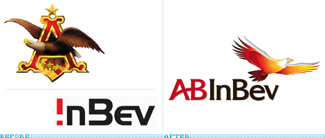
I also like the new AB InBev logo. It updates the 130-year-old Anheuser-Busch image and tones down the futuristic InBev font to create a new look that’s both classic and forward-looking.


The takeaway? Never overlook your branding. As Zorr says: “Time, budget, PR, and overall marketing efforts all play a role in the decision-making process.” A merger or acquisition can be exciting, tense, or even confusing for employees. Make sure they have a strong brand behind them and you’ll be on the path to success.

If you’re interesting re-branding your organization, talk to us. Been through a recent M&A? we’d love to hear from you.

Monday, April 16, 2012

The Creative Behind the Brande!


Recently we hosted a guest post by Kathryn, our Director of Client Services. This week we turn the blog over to our Creative Director, Clarissa Zorr. She’s an award-winning designer with more than 10 years of experience in developing and executing integrated brand strategies ranging from print to web to video. Clarissa is a member of AIGA, the professional association for design. Here, she tells us the about her branding process, her ideal client relationship, and when to break the rules. Take it away, Clarissa!

On my branding process:

Start With Trust
Whenever I begin a new branding project, I always like to have an in-person meeting with the project stakeholders.  This is how I establish mutual trust. They are entrusting us with their branding, their marketing, and their communications needs. How can they do that if they don’t know me personally? I am entrusting them to provide us with history, context and the business perspective that I need to help solve their problems through creative. In-person meetings provide real-time sharing and feedback that transcends telephone tag, and reigns high over email communications.

Assign Each Project A Clean Slate
Everyone has preconceived notions on just about everything, and I am certainly no exception. But when I approach any new branding project, I always begin with a clean slate. I try not to talk – I just listen. I let clients tell me what they need, what they think, what they like, what they don’t like. They might say something that will spark a totally new idea or creative direction, and I won’t get that freedom unless I have a blank canvas to start from.

The Creative Brief: Where Art Meets Science
Design is art, and therefore subjective; people may have different opinions but we all share one goal. That’s why, after that first meeting, my team and I put together a creative brief. The creative brief helps outline each project’s general information, its goals, objectives, and deliverables, helping everyone stay on track for the duration of the project. It’s the blueprint from which all things emanate, and it’s what we check our work against to make sure we’ve done our job well. I describe it as bringing “science” to the art of creativity.

Client Mood Board
On my inspiration:

Ideas Are Everywhere
When I start any new branding project, I look at what others are doing – not just competitors, but also other industries and trends, and even what aren’t people doing (and why), so I can always bring something fresh and unique to the client that’s meaningful and helps deliver their message. My inspiration comes from all sorts of places. I might see a texture in a wall that I could use as a website background. Or I might take a photograph of flowers and use it as the color palette for an identity. I also draw inspiration from many industry magazines and websites. One of my favorite publications is Communication Arts. They feature the cream of the crop in design, photography, illustration, typography, and advertising. Some websites I frequently visit to check out the latest in all things cool are FormFiftyFive,  NOTCOT, and AIGA.

On our mantra: "One Brand"

Employer Branding vs. Consumer Branding
I don’t see any creative or process differences between creating employee communications and consumer-facing campaigns. Design is all about problem-solving. In each case, there is a message to deliver to an audience, and it’s the designer’s job to make that message clear. As creative director, my goal is to build brands, creating emotional connections between our clients and their target audiences.  I seek to attract, educate, and inspire people with my work, and my approach doesn’t waver based on audience, geography, or medium.

Want to talk more about your branding? Write to me at Brandemix or check out some of our recent design work on Pinterest.